
A Guide to CSS Flexbox: Part I

CSS flexbox gives the ability to format HTML pages more efficiently. It provides complete control over the alignment, direction, order and box sizes. Before the CSS flexbox came into existence, we had floats. Floats allowed us to control only the horizontal position of the items. As the browser support of flexbox has been increased, you are most likely to use them while working with CSS.

Floats were tough. Even a simple header menu would need a lot of work. At the same time, flexboxes are easy to learn and gives a lot more ability to format.
🎁 Flex Containers and Flex Items
To start learning about flexboxes, we have to know about two things.
- Flex Containers
- Flex Items

You can get an idea about flex containers and flex items from the above image. The Flex container is used to group a bunch of flex items. And any HTML element that is a direct child of the flex container is a flex item. We use flex containers to determine the layout. However, the flex items can be manipulated individually also. Now, let's start to learn about the syntax of flexbox.
👜 Flex Container Properties
Following are some of the properties of the flex container.
⛳ 1. display:flex; Property
The display:flex; is used to invoke the flexbox. This style goes inside the parent element or the flex container as we say here. When the browser sees this, it will render everything inside the container as a flexbox.
.flex-container {
    display: flex;
}
Now, let's start experiencing the awesomeness of flexbox.
To start, we'll need an HTML file and a CSS file for styles. Let's say we have an HTML file called index.html and a CSS file called styles.css. We'll have a div called flex-container, and all the direct child elements of the flex-container will have a div of flex-item. So, our HTML file will look like this.
<!DOCTYPE html>
<html lang="en">
    <head>
        <meta charset="UTF-8">
        <meta name="viewport" content="width=device-width, initial-scale=1.0">
        <link rel="stylesheet" href="./styles.css">
        <title>CSS FLEXBOX</title>
    </head>
    <body>
    <header>
        <!-- Empty header tag -->
    </header>
    <div class="flex-container">
        <div class="flex-item red">1</div>
        <div class="flex-item green">2</div>
        <div class="flex-item blue">3</div>
        <div class="flex-item yellow">4</div>
        <div class="flex-item pink">5</div>
    </div>
    </body>
</html>
The classes red, green, blue, etc. are given to style the particular divs. Now, let's style the file.
* {
  margin: 0;
  padding: 0;
  box-sizing: border-box;
}

.flex-item {
  height: 10vh;
  width: 20%;
  margin: 5px;
  padding: 5px;
  font-size: 32px;
}

.red {
  background-color: red;
  color: white;
}

.green {
  background-color: green;
  color: white;
}

.blue {
  background-color: blue;
  color: white;
}

.yellow {
  background-color: yellow;
  color: black;
}

.pink {
  background-color: pink;
  color: black;
}
Here's our styles.css file. We are giving each of the flex items a height of 10 viewports and width of 20% of the parent. So, up until now, the output of our code will be like the below image,

This output is what we were expecting.
Now if we want all this flex items to align horizontally using floats, we'll need a lot of work. But using flexbox, aligning the items horizontally is just a single line of code. Adding the display:flex property to the parent will do the magic.
.flex-container {
    display: flex;
}
The above line will give us the output,

Isn't it awesome?
🥅 2. flex-wrap Property
The flex-wrap property has three options to choose from:
nowrapwrapwrap-reverse
The default property is nowrap. If you have ever used Microsoft Excel, then you must know what I am talking about.
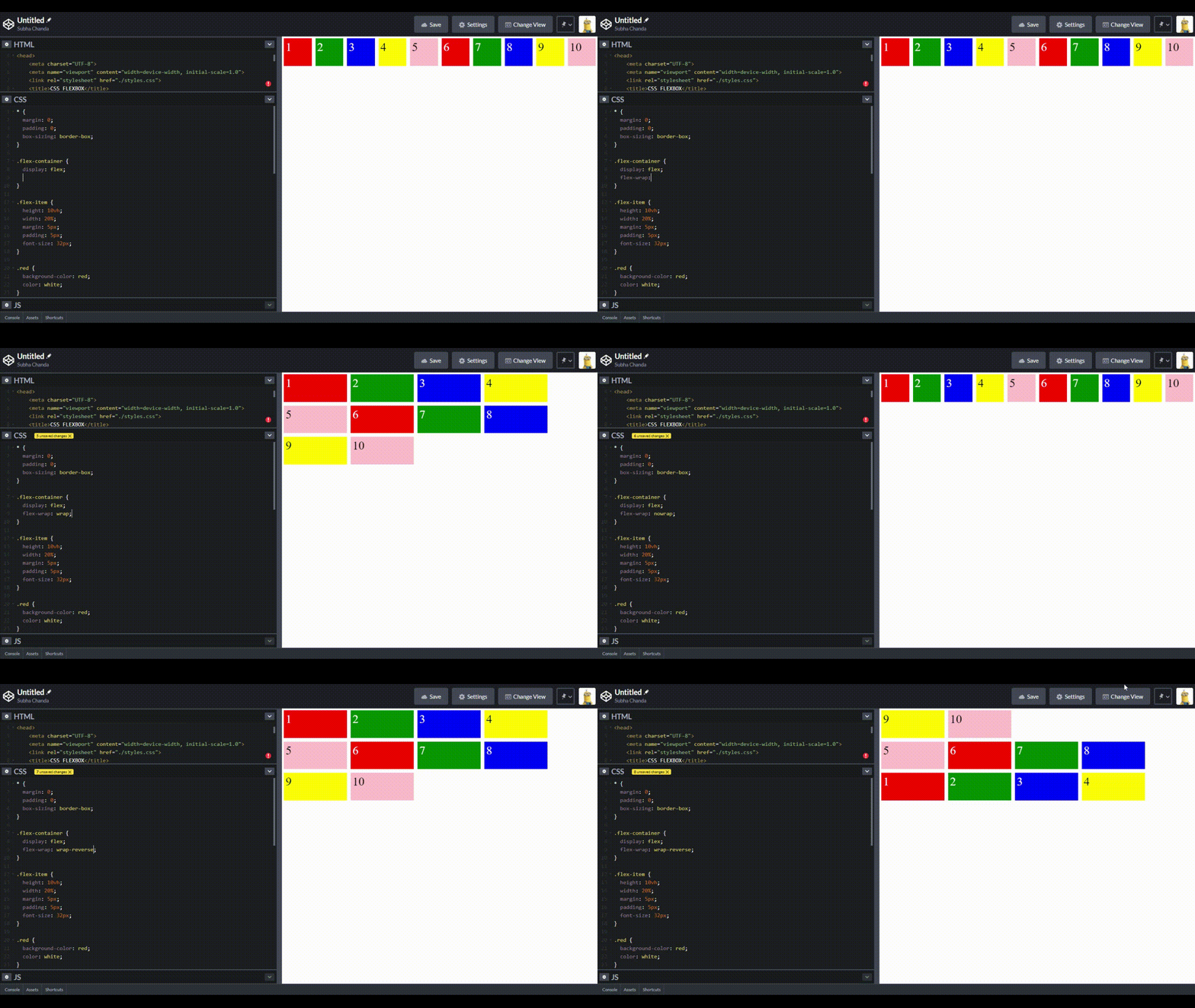
The wrap option will add the elements to a new line if it crosses its total width available to it. For example, our flex items have a 20% width plus some margins. So technically, only four flex-items should align in a single line. But our output sets all the five items in a single line. Because by default it is set to nowrap.
The width we assigned here works like a max-width. Now, suppose we set the flex-wrap property to wrap. In that case, it'll take the width size given to the items and only align the maximum number of elements that can be added. And finally, the wrap-reverse property value will wrap all the items in reverse order.
Here is the syntax:
/* Assuming .flex-container is the Parent Container */
.flex-container {
  display: flex;
  flex-wrap: nowrap | wrap | wrap-reverse;
}
You can see how the properties affect the style from the GIF below:
🃏 3. flex-direction Property
As you can see, adding the display:flex property will align all our flex-items horizontally. But what if we don't want to align them in such a way? To control the alignment, we have the flex-direction property. This has four different options:
- row
- row-reverse
- column
- column-reverse
The default is the row. If we set it to column, our flex items will be aligned vertically. The row-reverse option will set the direction opposite to the text-direction.
Here is the syntax:
/* Assuming .flex-container is the Parent Container */
.flex-container {
  display: flex;
  flex-direction: row | row-reverse | column | column-reverse;
}
Check the GIF to get some more idea about it.

Below we have a code example:
🧩 4. flex-flow Property
This property is a shorthand for the flex-wrap and flex-direction together. Now we have an idea about both the properties. In flex-flow, we describe the direction of the flex and the wrapping in a single line, like, flex-flow: wrap column-reverse; This will wrap our flexbox and will align the flex-items in the row-reverse order.
Let's take an example:
/* Assuming .flex-container is the Parent Container */
.flex-container {
  display: flex;
  flex-flow: row wrap;
}
⚗ 5. justify-content Property
To understand the justify-content property, first, we have to understand some terminologies that are connected to flexbox. Consider the image below:

- Main Axis: It is the primary axis through which all the flex-items are laid off. It does not have to be horizontal always. It depends on the flex-direction property.
- Cross Axis: It is the axis perpendicular to the main axis. So, if the main axis is the X-axis(
flex-direction:row) then it'll be the Y-axis and vice-versa.
Now, let's come back to the justify-content property again. This property specifies the alignment along the main axis. We mostly use these properties with justify-content:
- Flex-start: Items are packed to the start of the main axis.
- Center: Items are packed to the center of the main axis.
- Flex-end: Items are packed flush to the end of the main-axis
- Space-between: The first item is packed to the start of the main axis; the end item is packed to the end of the main axis. The spacing between the pairs of each adjacent elements is the same.
- Space-around: The flex-items are evenly distributed along the main-axis. The spacing between each adjacent elements is the same. But the space before the first item and after the last item is half of the spacing between each of the elements.
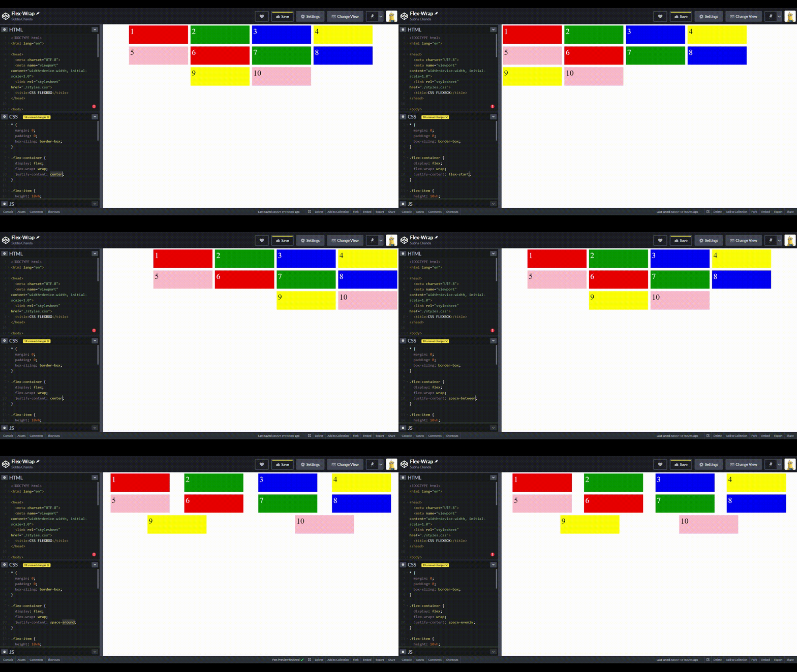
- Space-evenly: The spacing between all the adjacent elements and space before the first item and after the last item all are same. All the spacings are evenly distributed here.
The images below show the alignment properties and how the elements align according to the values:

And the next three,

Here is the syntax:
/* Assuming .flex-container is the Parent Container */
.flex-container {
  display: flex;
  justify-content: flex-start | flex-end | center | space-around | space-between | space-evenly;
}
Here, in this GIF, you can see how the flex-items change depending on the justify-content property.
You can also play with this CSS property in the below live HTML/CSS editor:
📖 6. align-items Property
We have seen that the justify-content property helps us to align items in the main axis. To align items in the cross-axis, we have to use the align-items property. Usually, we use the below values with align-items:
Flex-start: Aligns the items to the start of the cross axis.
Flex-end: Aligns the items to the end of the cross axis.
Center: Aligns the items to the center of the cross axis.
Stretch: Stretches the items to fill the container
Baseline: The baseline will align the flex-items to the baseline of the content. If you are confused about what actually baseline is, wikipedia) describes it as, “The line upon which most letters "sit" and below which descenders extend.” The below image from Wikipedia will clear about it more.

Here is an image that pictorially explains the different values:

Here is the syntax:
/* Assuming .flex-container is the Parent Container */
.flex-container {
  display: flex;
  align-items: flex-start | flex-end | baseline | stretch;
}
You can play with it here,
🥏 7. align-content Property:
The align-content property sets and distributes the space between and around the flex-items along the cross axis of the flexbox. It works like the justify-content for the cross-axis. It'll only work if your container is set to flex-wrap: wrap.
The values that align-content property takes are:
- Flex-start: Aligns items to the start of the cross-axis of the container.
- Flex-end: Align items to the end of the cross-axis.
- Center: Align items to the center of the cross-axis.
- Stretch: Stretches or takes the full space for the flex items.
- Space-between: Spaces are evenly distributed.
- Space-around: Items are evenly distributed between all the lines.

Here is the syntax:
/* Assuming .flex-container is the Parent Container */
.flex-container {
  display: flex;
  align-content: flex-start | flex-end | center | stretch | space-between |
    space-around;
}
In this article, we primarily discussed the flexbox properties that can be applied to a flexbox container. In the next article, we’ll discuss the properties that apply to the flexbox items. Until then, try practicing these properties and share your awesome codes with us.


